Twitter is Going Crazy Over State Farm’s Fidget Logo
Remember when, in 2012, State Farm changed its logo for the first time after 59 years?

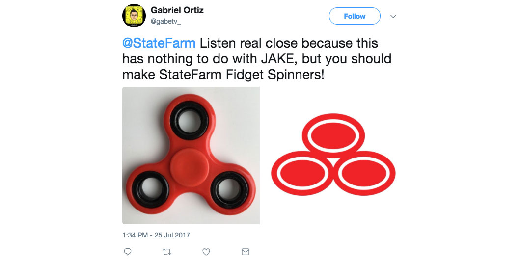
Well, now Twitter is going crazy over the resemblance of State Farm’s logo to a fidget spinner .
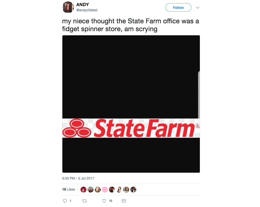

While on the subject of ‘brand refresh’, recall MassMutual, MetLife, and Chubb…below.
1. MassMutual
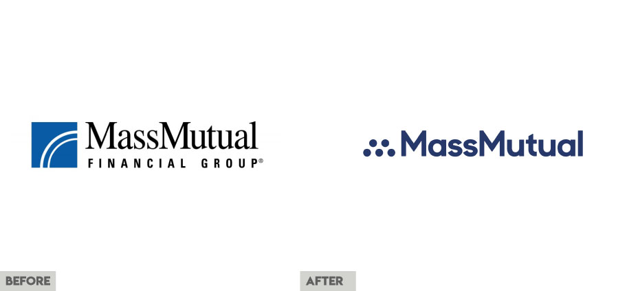
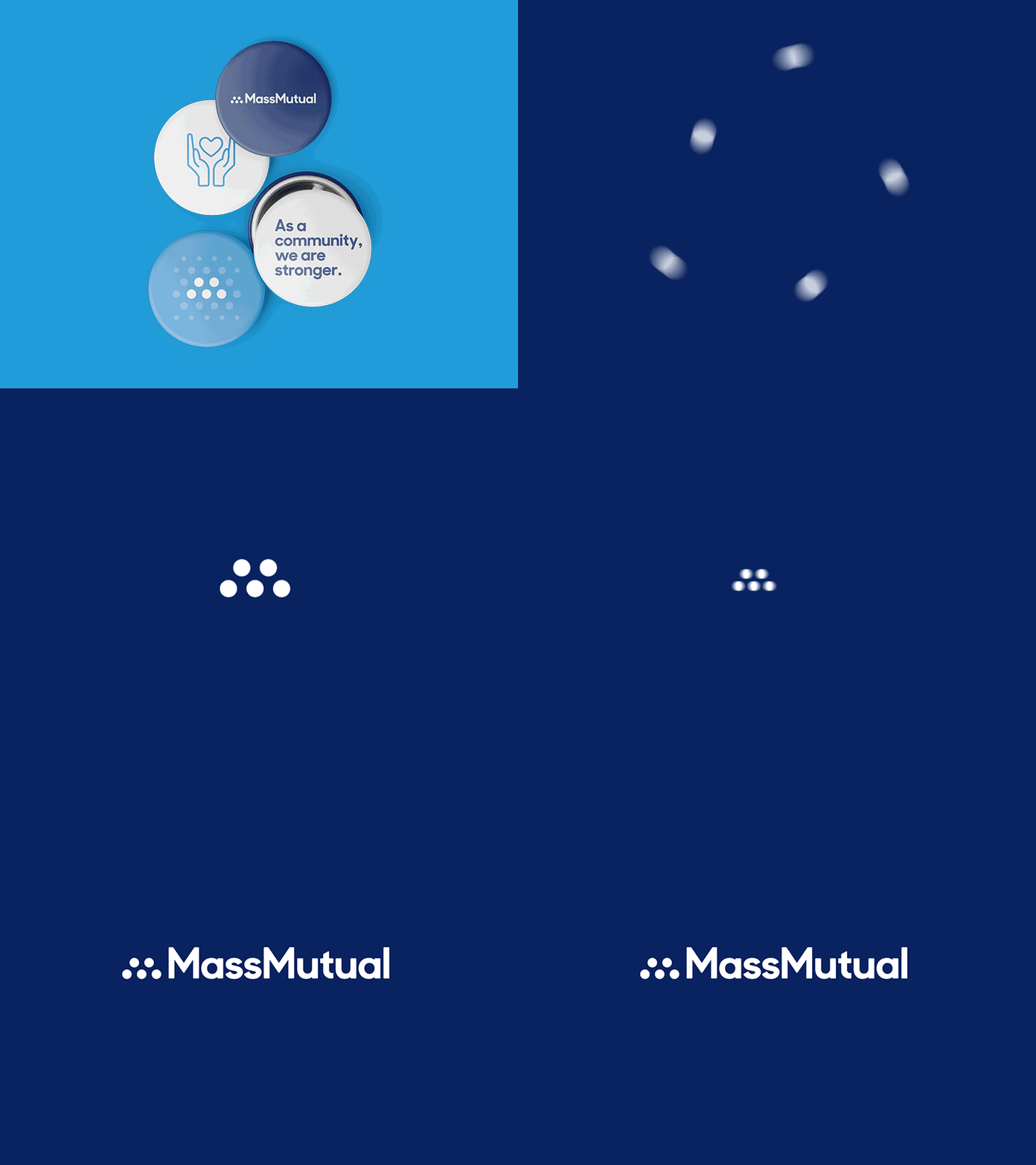
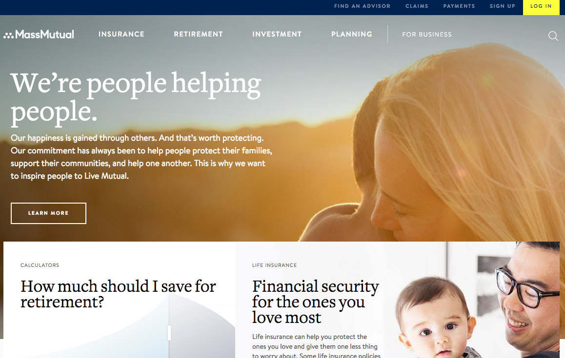
In May 15, 2017, the 166-year-old insurer announced a new look that aims to reinforce the company’s vision and identity – one that celebrates independence and true happiness while acknowledging our reliance on one another. “Much has changed in the past decade – we live our lives differently, connecting on social media and depending on each other at all stages of life,” said Jennifer Halloran, MassMutual head of Brand and Advertising. “As we took a close look at the key attributes that distinguish us from our competitors, we saw this as not only an opportunity to communicate who we are, but to also help more Americans with holistic financial solutions at a time they need the help the most.” The refresh included a multi-channel advertising campaign and a dramatically revamped website. Here’s a closer look at the brand’s image:
Before.
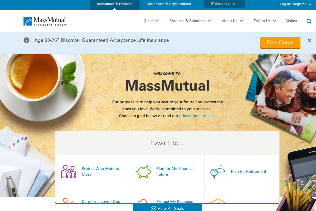
After.
2. MetLife
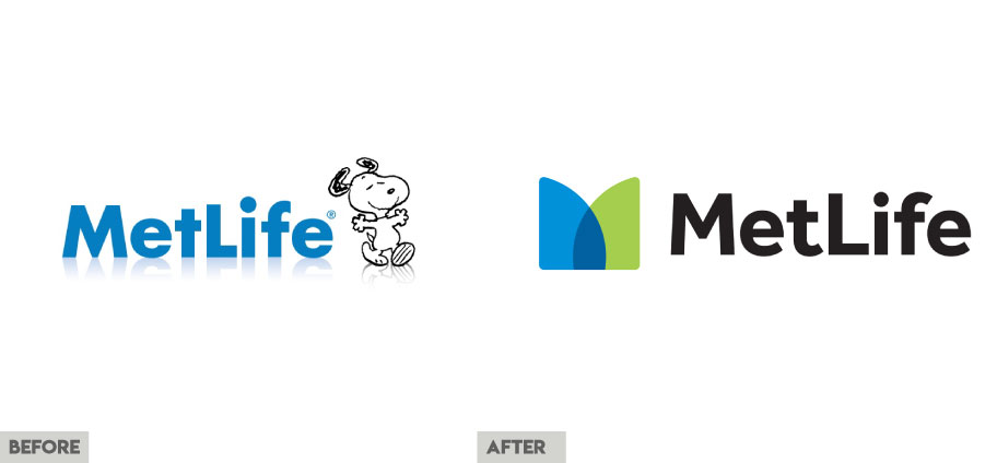
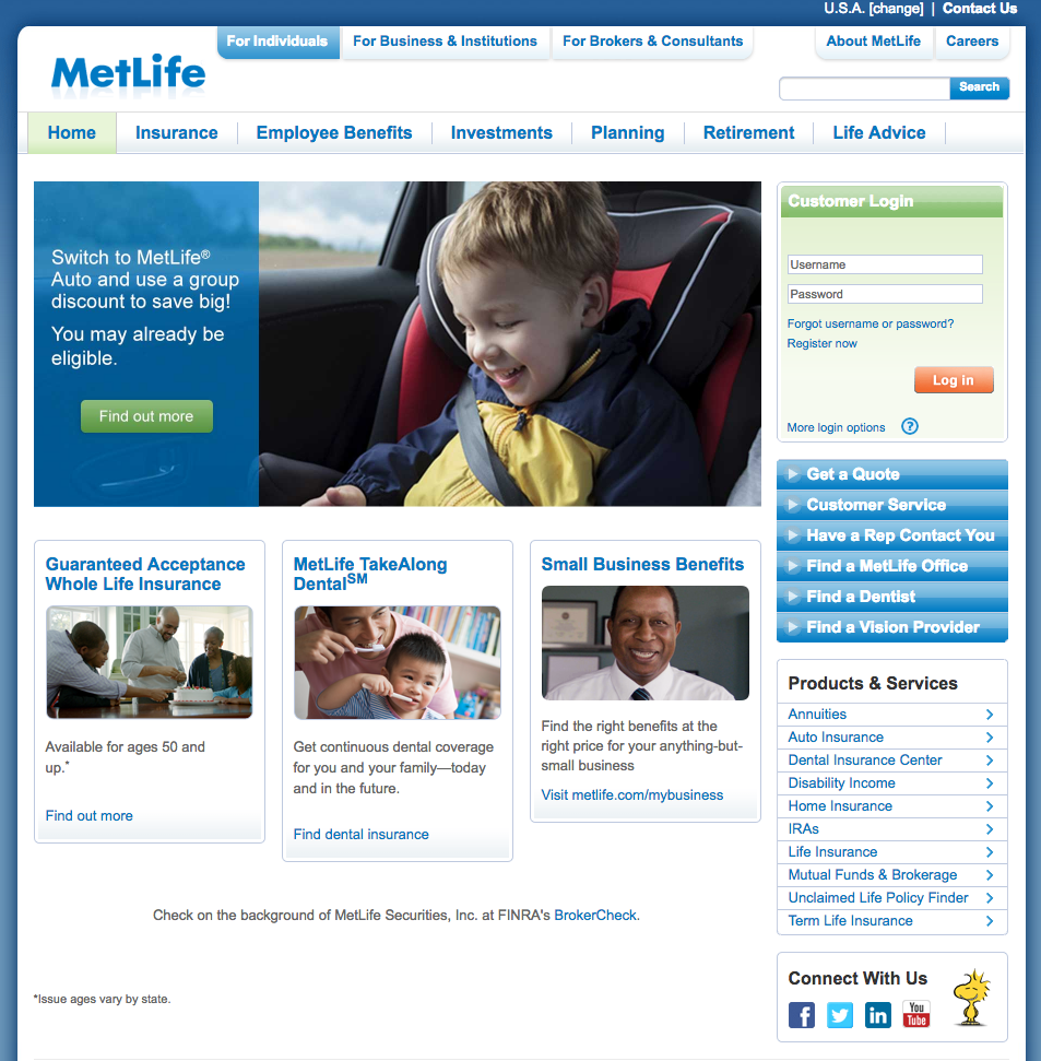
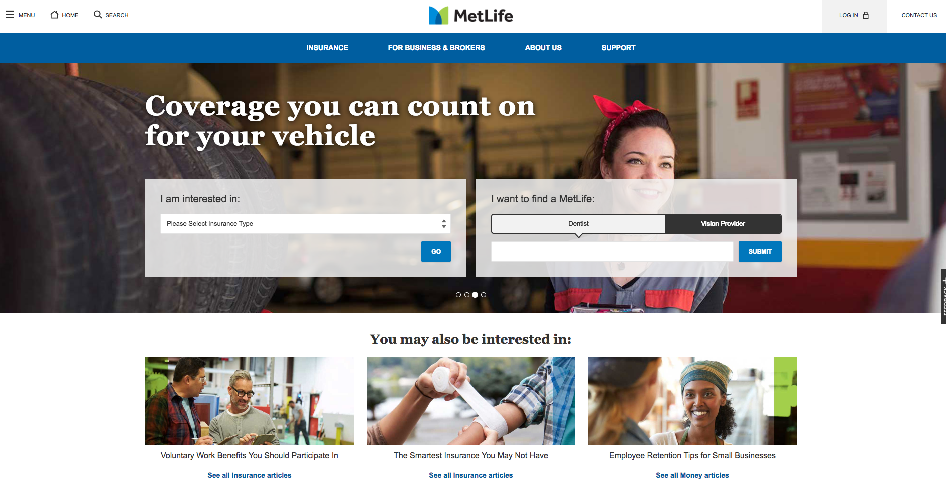
In October 20, 2016, the 148-year-old insurer, at the time, announced a new global brand that aims to bring to life MetLife’s role as a trusted partner to its customers as they navigate life’s twists and turns. The refresh included an updated visual identity and a new tagline: “MetLife. Navigating life together”. “To adapt to our changing world, we are re-thinking how we do business. We are moving away from a traditional product-development model to one driven by customer insights,” said Steven A. Kandarian, chairman, president and chief executive officer of MetLife, Inc. “Our new brand reflects our company’s transformation and differentiates us in the marketplace, ultimately driving greater value for our customers and shareholders.” This move also signaled the phase out of Snoopy and the Peanuts Gang. Here’s a look at the company’s website:
Before.
After.
3. Chubb
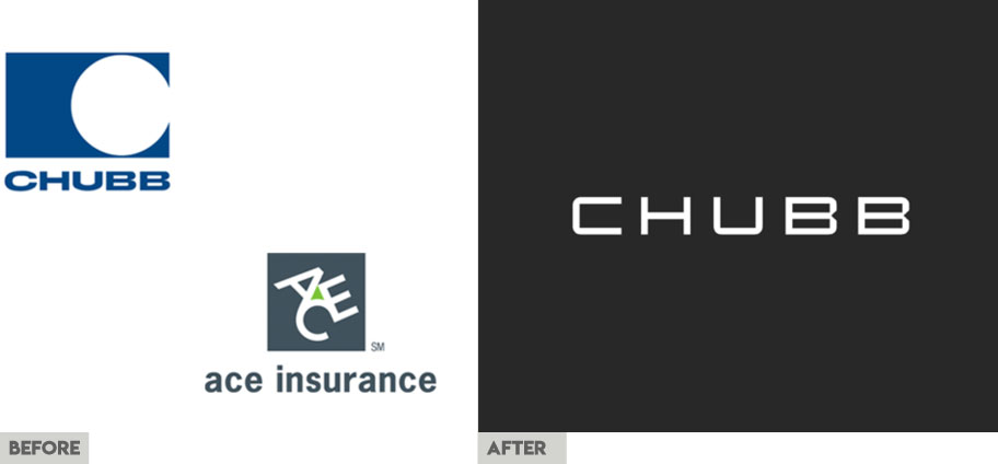
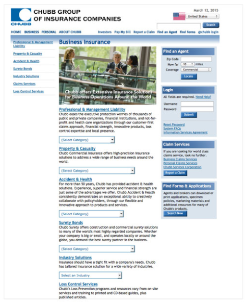
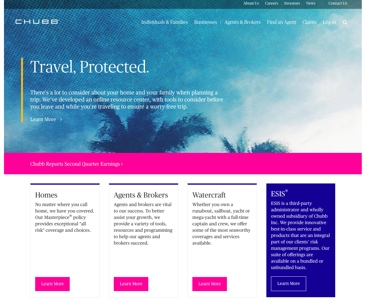
Following the completion of the Chubb-ACE merger in 2016, the company introduced a new colorful identity that aims to demonstrate the insurer’s superior underwriting, service and execution skills.
Before.
After.
Bottom Line: in the name of entertainment, interdependence, if you don’t try you can’t fail, and craftsmanship.


