Spotted: Zurich’s new look
Zurich has refreshed its zurich.com website to better serve the needs of the rapidly growing number of visitors to its flagship portal.
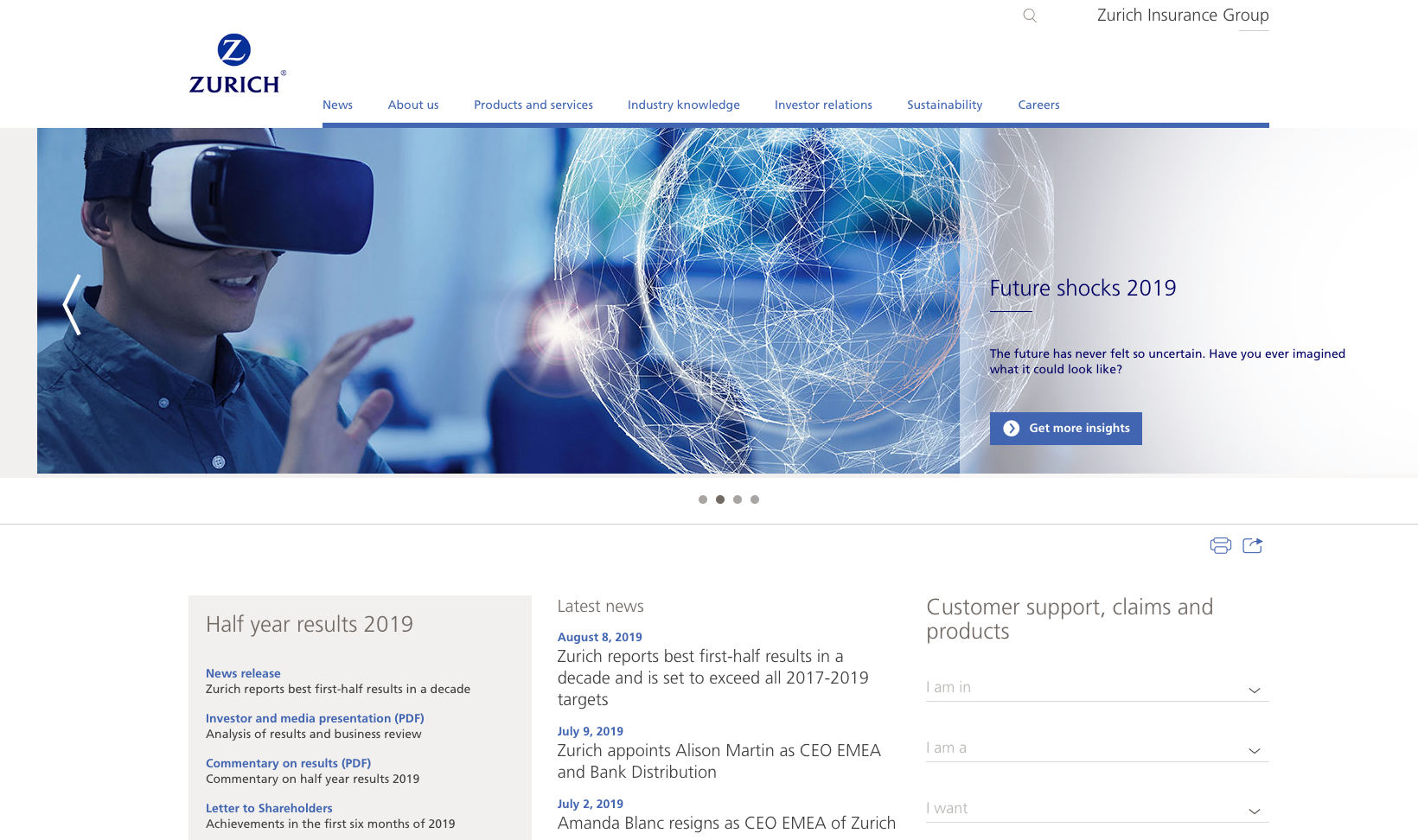
Before:

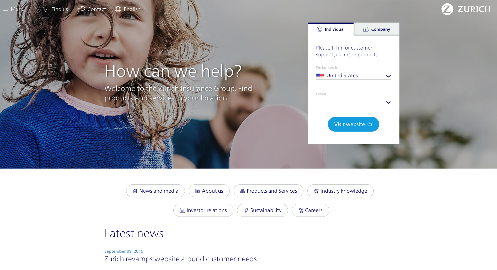
After:

In accordance with Zurich’s strategy to put customers first, the most important changes will make it easier and quicker for them to find services, products, contacts and locations. Customers are the largest group of visitors to the website.
The changes mark the start of a process of continual and data-driven improvement. However, the overall architecture of the site and organization of the information remains unchanged, so regular visitors will quickly find what they are looking for.
In other changes, articles and press releases are easier to read on desktop computers as well as mobile devices, and have a more dynamic layout. Video galleries are part of a multimedia storytelling approach and cleaner pages allow content to flow smoothly.


