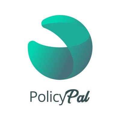
PolicyPal Changes Logo, Again
Singapore-based digital insurance broker PolicyPal has changed its logo, again.
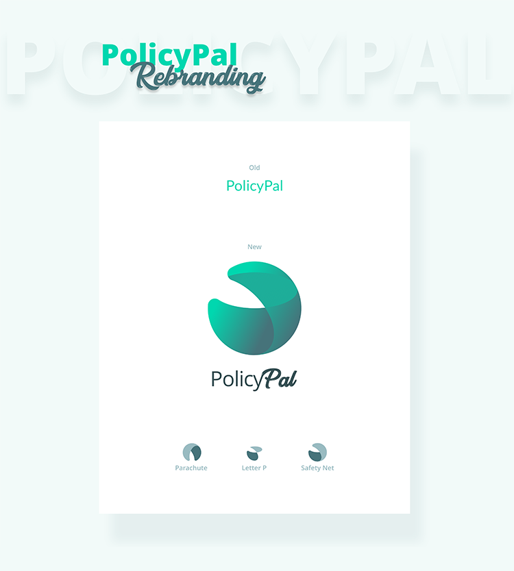
“The new PolicyPal logo is made up of circles and ovals with measurements based on the golden ratio, a geometric proportion that has been theorized to be the most aesthetically pleasing to the eye. It is drawn in a way to simulate the shape of a parachute/safety net (depicting safety, coverage and protection) as well as a silhouette of the letter “P”.”
Recall: back in 2017, PolicyPal received two legal notices from Travelers regarding its umbrella logo and so it decided to the drop the umbrella.
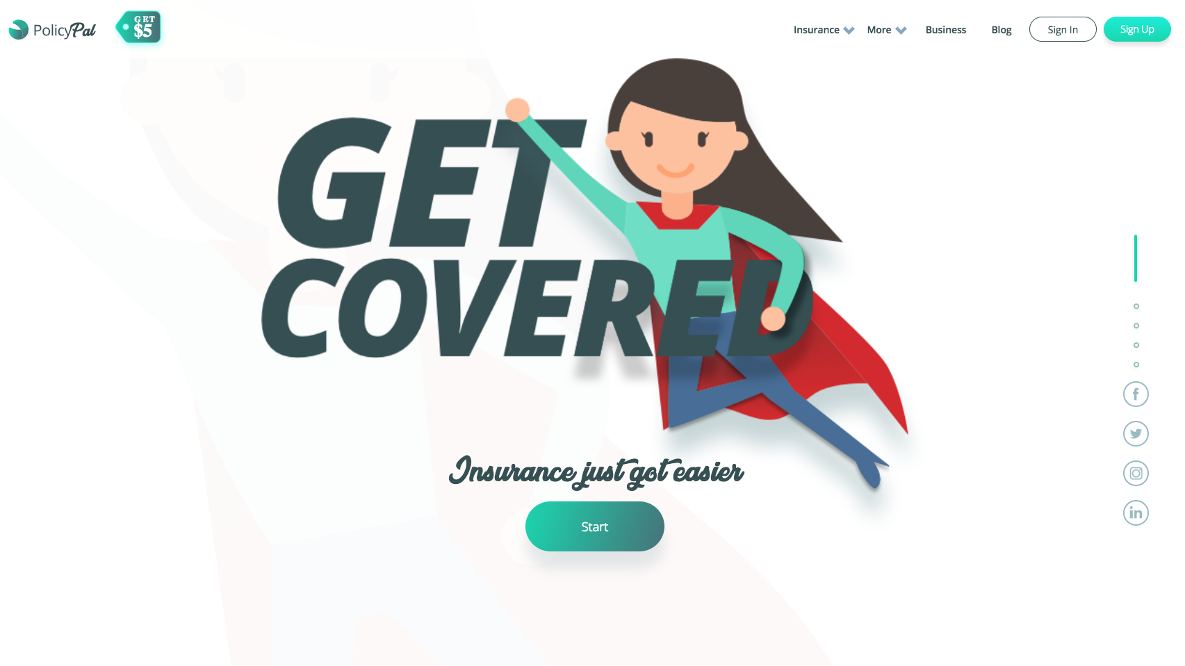
And with the new logo, comes a new site (and a change from a .co to a .com domain extension):
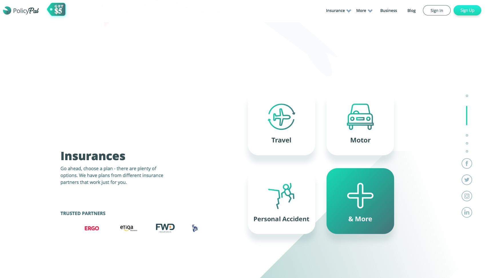
Last, PolicyPal announced their new partnership with FWD and the addition of new products such as personal insurance by Sompo, MSIG, ERGO and Tokio Marine.


